Reality check
Everyone has a villain. The data disagrees.
Carbs, meat, sugar, seed oils — every theory of the obesity epidemic has to fit one chart. Most never check. Let's check.

Dr. Andreas Eenfeldt, MD · · 8 min read
Here is the most important chart in nutrition, and almost nobody shows it honestly.
A century of slow creep — then a turn around 1980
The testShare of US adults with obesity (BMI ≥30), 1860s–2023
Source: NHANES/CDC · Helmchen & Henderson 2004
measuredestimate
See the data
| Year | Obesity |
|---|---|
| 1865 | ~1.2% |
| 1890 | ~3.4% |
| 1962 | 13% |
| 1974 | 15% |
| 1980 | 15% |
| 1991 | 23% |
| 2000 | 31% |
| 2004 | 32% |
| 2008 | 34% |
| 2012 | 35% |
| 2014 | 38% |
| 2016 | 40% |
| 2018 | 42% |
| 2022 | 40% |
For a hundred years, obesity in America crept along slowly — through world wars, depressions, and booms. Then, around 1980, the line turns and goes nearly vertical: from about 15% to about 40% of adults in four decades.
Whatever caused that turn, it wasn't a collapse in willpower. Human character did not change in 1980. Genes don't rewrite themselves in a generation. Something changed around us, not in us.
Human character did not change in 1980. Something changed around us, not in us.
That chart is also a test. Any theory of the obesity epidemic — carbs, meat, sugar, whatever your favorite villain — has to fit that curve. Most people never check. Let's check.
Reality check #1: “It's the carbs”
If carbohydrate were the driver, obesity should track the share of our calories coming from carbs.
Carb share was highest when obesity was lowest
Doesn't fitSource: USDA ERS · NHANES/CDC
measuredestimate
See the data
| Year | Obesity | Carbohydrate |
|---|---|---|
| 1865 | ~1.2% | — |
| 1870 | — | ~55% |
| 1890 | ~3.4% | — |
| 1909 | — | ~57% |
| 1920 | — | ~56% |
| 1940 | — | ~51% |
| 1962 | 13% | — |
| 1965 | — | ~46% |
| 1971 | — | 44% |
| 1974 | 15% | — |
| 1980 | 15% | 45% |
| 1990 | — | 48% |
| 1991 | 23% | — |
| 2000 | 31% | 51% |
| 2004 | 32% | — |
| 2008 | 34% | — |
| 2010 | — | 49% |
| 2012 | 35% | — |
| 2014 | 38% | — |
| 2016 | 40% | — |
| 2018 | 42% | 47% |
| 2022 | 40% | — |
| 2023 | — | 47% |
It doesn't. The American diet was at its most carbohydrate-heavy in the early 1900s, when obesity barely existed. The carb share fell through the century, rose modestly in the 1990s, and has been declining since 2000 — while obesity kept climbing the whole time.
The honest fine print: serious low-carb arguments are about carb quality— refined starch, sugar, glycemic load — not the percentage of calories. Refined carbs absolutely belong in this story. But “carbohydrate made America obese” fails the chart it needs to pass.
Reality check #2: “It's the meat and animal foods”
Same test, opposite villain.
The diet grew more plant-based as obesity took off
Doesn't fitSource: USDA ERS · NHANES/CDC
measuredestimate
See the data
| Year | Obesity | Animal foods |
|---|---|---|
| 1865 | ~1.2% | — |
| 1870 | — | ~40% |
| 1890 | ~3.4% | — |
| 1909 | — | ~41% |
| 1940 | — | ~43% |
| 1962 | 13% | — |
| 1965 | — | ~44% |
| 1974 | 15% | — |
| 1977 | — | 45% |
| 1980 | 15% | — |
| 1990 | — | 37% |
| 1991 | 23% | — |
| 2000 | 31% | 31% |
| 2004 | 32% | — |
| 2008 | 34% | — |
| 2010 | — | 30% |
| 2012 | 35% | — |
| 2014 | 38% | — |
| 2016 | 40% | — |
| 2018 | 42% | — |
| 2022 | 40% | — |
| 2023 | — | 30% |
By share of calories, the American diet became more plant-based exactly as obesity exploded. Animal foods fell from roughly 45% of calories in the late 1970s to about 30% by 2000. The two lines cross.
By share of calories, the American diet became more plant-based exactly as obesity exploded.
The honest fine print: total meat in absolute pounds rose (chicken especially), and this chart doesn't vindicate bacon or indict lentils. Look at which plant calories grew: sugar, refined flour, and vegetable oil — industrially processed plants, not vegetables and beans.
Reality check #3: “It's the sugar”
The most-blamed ingredient of all. And here's where honesty gets interesting: sugar half-passes the test.
Sugar tracked obesity for a century — then fell
Fits until 2000Source: USDA ERS · Welsh 2011 · NHANES/CDC
measuredestimate
See the data
| Year | Obesity | Added sugar |
|---|---|---|
| 1865 | ~1.2% | — |
| 1890 | ~3.4% | — |
| 1900 | — | ~7% |
| 1930 | — | ~9% |
| 1960 | — | ~12% |
| 1962 | 13% | — |
| 1974 | 15% | — |
| 1977 | — | 13% |
| 1980 | 15% | — |
| 1990 | — | 16% |
| 1991 | 23% | — |
| 2000 | 31% | 18% |
| 2004 | 32% | — |
| 2008 | 34% | — |
| 2010 | — | 15% |
| 2012 | 35% | — |
| 2014 | 38% | — |
| 2016 | 40% | — |
| 2018 | 42% | — |
| 2022 | 40% | — |
| 2023 | — | 13% |
Added sugar rose alongside obesity for most of a century — a genuine co-trend, and sugar genuinely is low-satiety, especially when you drink it. But around 2000, sugar consumption peaked and then fell by roughly a fifth.Obesity didn't pause. It kept climbing for two more decades.
If sugar were thedriver, the last twenty years shouldn't look the way they do. Sugar is one real ingredient in the problem — not the whole problem, and not the reason the epidemic continued after we started cutting back.
Reality check #4: “It's the seed oils”
The internet's newest villain deserves the same honest treatment — because this is the one chart that doesn't fall apart.
Seed oils rose for a century and never fell
Tracks the curveSource: Blasbalg 2011 · USDA ERS · NHANES/CDC
measuredestimate
See the data
| Year | Obesity | Seed oils |
|---|---|---|
| 1865 | ~1.2% | — |
| 1890 | ~3.4% | — |
| 1909 | — | ~3.5% |
| 1930 | — | ~5% |
| 1950 | — | ~8% |
| 1962 | 13% | — |
| 1970 | — | 11% |
| 1974 | 15% | — |
| 1980 | 15% | — |
| 1990 | — | 14% |
| 1991 | 23% | — |
| 2000 | 31% | 16% |
| 2004 | 32% | — |
| 2008 | 34% | — |
| 2010 | — | 17% |
| 2012 | 35% | — |
| 2014 | 38% | — |
| 2016 | 40% | — |
| 2018 | 42% | — |
| 2022 | 40% | — |
| 2023 | — | 19% |
Seed oils are the tightest, most persistent co-trend of any single factor here: a monotonic rise from about 3% of calories to about 19%, and unlike sugar, never a decline.Anyone who tells you there's nothing to see here isn't looking at the data.
But correlation is where the case is strongest — and weakest. The popular claim is that these oils are uniquely toxic (the omega-6 story), and the human trial evidence for that mechanism is genuinely weak. The better-supported read: seed oils are the cheap added fat of ultra-processed food. They're in the chart because they're how modern food got energy-dense and cheap. They track the epidemic because they arethe epidemic's fat supply — a marker of the bundle, not a poison in it.
So what actually fits the curve?
Ultra-processed food and obesity rise together, start to finish
Fits, start to finishSource: Juul 2022 · CDC/NCHS 2025 · NHANES/CDC
measuredestimate
See the data
| Year | Obesity | Ultra-processed food |
|---|---|---|
| 1860 | — | ~2% |
| 1865 | ~1.2% | — |
| 1880 | — | ~3% |
| 1890 | ~3.4% | — |
| 1900 | — | ~5% |
| 1920 | — | ~9% |
| 1940 | — | ~14% |
| 1960 | — | ~20% |
| 1962 | 13% | — |
| 1970 | — | ~24% |
| 1974 | 15% | — |
| 1980 | 15% | ~30% |
| 1990 | — | ~42% |
| 1991 | 23% | — |
| 2000 | 31% | — |
| 2001 | — | 54% |
| 2004 | 32% | — |
| 2008 | 34% | — |
| 2012 | 35% | — |
| 2014 | 38% | — |
| 2016 | 40% | — |
| 2018 | 42% | 57% |
| 2022 | 40% | 53% |
One line tracks obesity across the entire 160 years: the share of our calories coming from ultra-processed food — from a rounding error to more than half of everything American adults eat (53% of calories, measured in 2021–2023).
And unlike the single villains, this one has a clock that fits. The steep part of the obesity curve follows the precise decade when the food environment transformed: the 1973 farm pivot to cheap corn and soy, HFCS scaling in the late 70s, the 1980 low-fat guidelines that industry answered with low-fat/high-sugar products, portion sizes inflating ~138%, eating out doubling, food advertising saturating childhood. Five changes moving together, all in the same direction: calories got cheaper, more processed, bigger, everywhere, and faster to eat.
Now the sentence that keeps us honest: these charts are correlations, and correlations can't prove cause. The causal evidence comes from controlled experiments.
That's the mechanism the single-villain stories keep missing. It isn't one molecule. It's food engineered — sometimes deliberately, always profitably — to be energy-dense, protein-poor, hyperpalatable, and fast to eat. Food that defeats the fullness systems you were born with.
What this means for you
Three things, and the first one matters most.
It's not your fault, and it's not your willpower. You are running century-old satiety wiring in a food environment engineered to beat it. Blaming yourself for losing that fight is exactly the frame that lets the engineering continue.
And it is navigable. The same science that explains the charts tells you what to do: eat food that fills you up per calorie. More protein and volume, less energy density, fewer of the engineered combinations that override fullness. Not a diet. Not a banned-foods list. Any eating pattern — omnivore, plant-based, low-carb — can be built this way.
That's measurable.We built a score for it: satiety per calorie, 0–100, computed from public data. The formula is Ted Naiman's satiety-per-calorie model, v14-S. Sately runs it unchanged as formula 3.0, and publishes it so you can check it.
So what does processing actually do?
That score, usefully, does not know what “ultra-processed” means and never asks. It reads what is on the label. Three properties can earn a food a good number, and one of them is enough on its own: how much water it still holds, how much of its energy is protein, and how much fiber rides along per calorie. Two things take the number back: sugar, softened when protein or fiber came with it, and the savoury convergence of fat with starch, sharpened by salt and sugar and only in food dense enough for it to matter. It has no theory to defend here. Processing reaches the number only through what it does to the food, and that turns out to be four things, always in the same direction.
Water comes out. Drying, baking and frying concentrate what is left, and water is a route to a good score all on its own. Fat and sugar go in. Usually together, and usually with salt, because that is what sells. Protein gets diluted — and appetite keeps eating until it finds the protein it was after. Texture softens, so the food goes down faster, and eating the same meal faster means eating more of it.
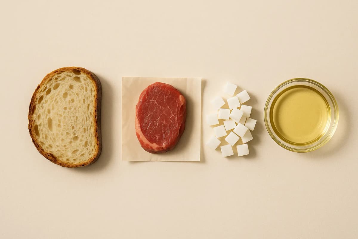
Watch it happen to one potato — the clearest case, because nothing is added here at all except heat and oil.
 66PotatoBoiled, plain
 57Baked potatoIn its skin
 24French friesCut and fried
 10Potato chipsSliced thin, fried
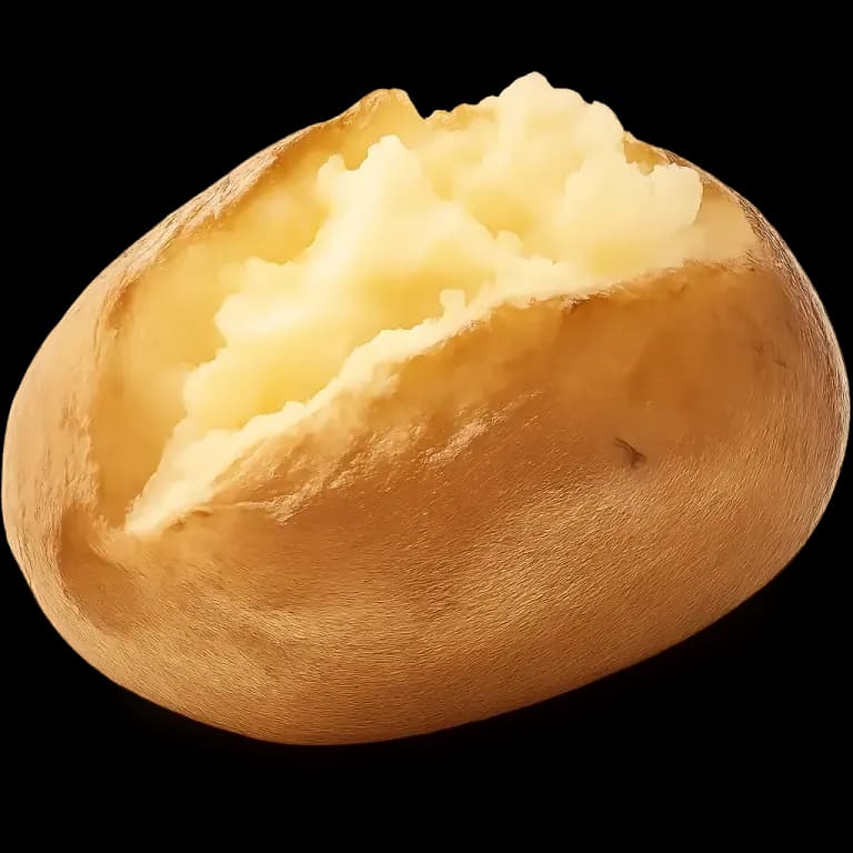
A tomato makes the other half of the point, which is that the industrial step is not automatically the expensive one.
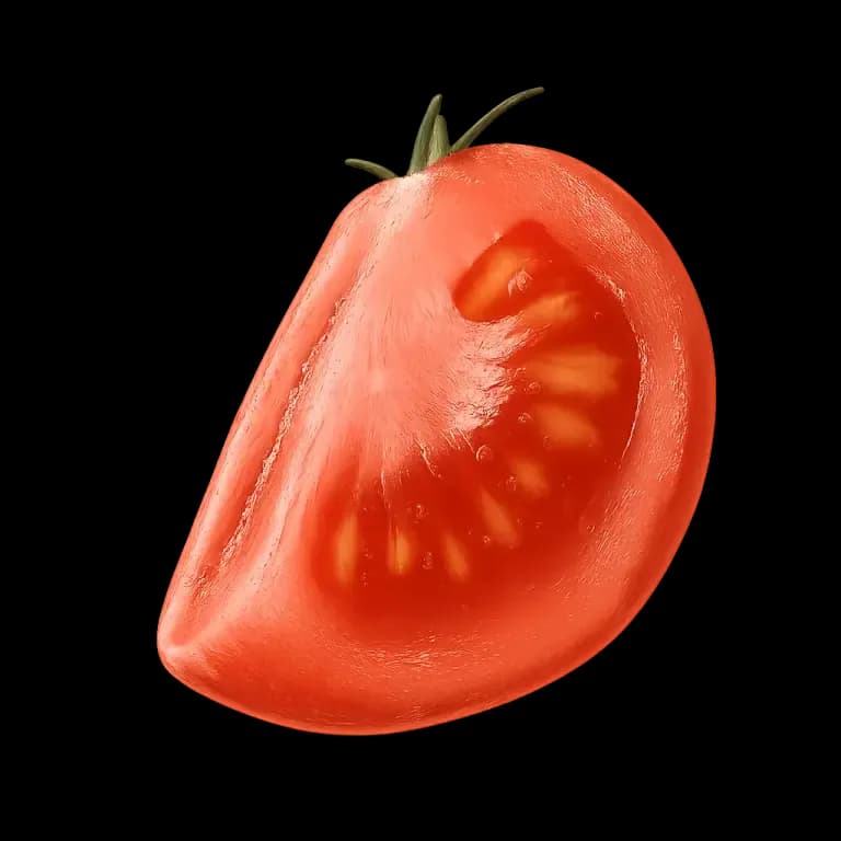 96TomatoWhole, raw
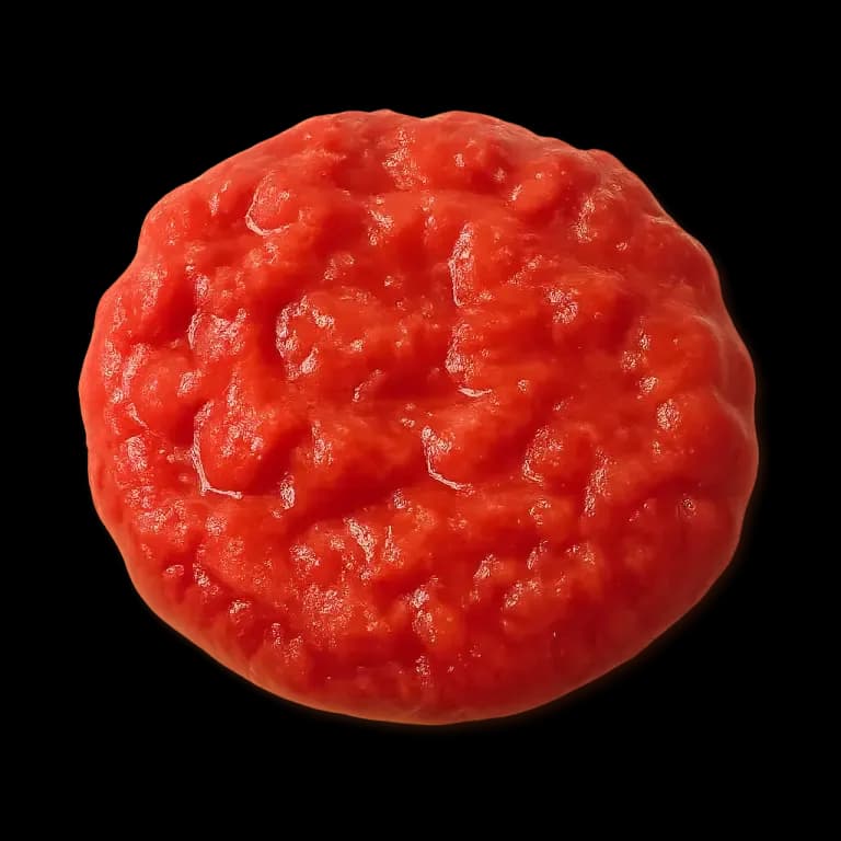 89Canned tomatoesCooked and tinned
 90Tomato sauceSalt added
 9KetchupSugar and salt, concentrated
And a pig shows the same arithmetic in animal food.
 95Pork tenderloinThe plain cut
 85Sliced hamCured, still mostly meat
 37BaconCured, salted, rendered
 23Hot dogEmulsified, fat and salt
But processing is not the villain either
Which is where this article has to take its own medicine. Everything above points at processing, and the obvious next step is to crown it — the single villain, at last, and this time the data agrees. It doesn't, quite.
Tinning, freezing, fermenting, rolling and extruding are all processing. Where they do not remove the water, add the fat or dilute the protein, the score barely notices.
 100KimchiFermented for weeks
 100Canned tunaCooked in the tin
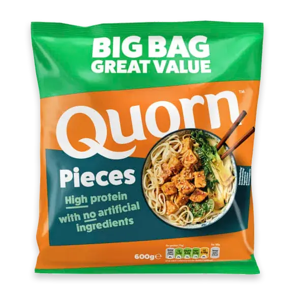 91QuornPiecesGrown in a fermenter, extruded
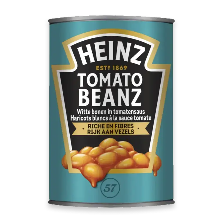 79HeinzBeanzTinned, sugar and salt added
 76Refried beansCooked, mashed, tinned
 75OatmealRolled, steamed, boiled
Kimchi is cabbage that has been fermented for weeks. Quorn is a fungus grown in a fermenter and extruded into pieces — about as industrially made as food gets, and it scores in the nineties. What these six have in common is not that they are natural. It is that nothing was taken out of them that was doing any work.
“Processed” describes how a food was made. It does not, on its own, measure what it does to you.
So the honest version of this article's conclusion is narrower than its headline, and more useful for it. The problem is not that food came out of a factory. It is that most of what comes out of a factory has had the water and the protein taken out, and the fat, sugar and salt put in — because that is what sells. Processing is how it is done. It is not why it works.
Which is a testable thing to shop by, and the practical half of it — a hundred-odd foods with their scores, aisle by aisle, including the ones with a health halo that quietly cost the most — is in the best high-satiety foods.